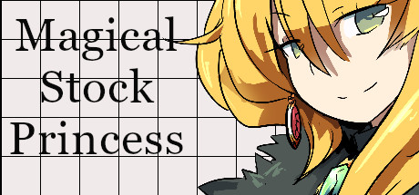
MSP is an arcade/rpg hybrid game. I created it being inspired by the difference of emotions and experience that arcade games and rpg. I often find myself torn between the adrenaline and purpose of arcade games and the story-driven emotions, attachment and sense of persistence of rpg games. Therefore, I created the perfect mix!
You can read a genuine, unbiased and fantastic review that warmed my heart /<3/ here It's a short, humble game made with Rpg Maker but it's sincere and full of personality. I am really proud of it. You can buy it on Steam or download it for free on Itch.io. Your call.
E dopo anni, mi son deciso di rifarlo da capo con Construct 3, adesso supporta due giocatori, il joypad ed é bellissimo
Appesi a un filoAppesi a un filo is a short chiptune punk album. Years ago, with a couple of friends we had this band called Voci Dalle Fogne (a name I really like). It never got anywhere, mostly due to my fault, but I really like the vibes. Appesi a un filo is it's legacy. Appesi a un filo means "hanging on a thread" in Italian, it's a reference to the frailty og human life and a hanging rope. Yeah it's quite a dark title, but as my friend said "it's an album that starts dark and ends happy" which is what music can do. Music is good for the soul. Make some.
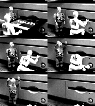
The strange life of AlisI don't like at all the aesthetics of the video but I like the concept. I'll paste the submission text that I wrote myself. "The Strange Life of Alis explores the concept of empathy and connection between sentient beings, the importance and need for physical presence and reciprocity, and the loss of this aspect associated with death." "The helium balloon soul constantly pulls towards heaven, while the frail, mortal shell made of a box and wires keep it anchored to the transience of earthly life." "and the display of significant parts of the programming code allowing the viewer to peek inside a soul, a longed-for yet forbidden element of human interactions." Quite cool, eh? It was made for uni coursework (and I got a good grade wooo). You can find some of the other projects here Fun fact: the microbit used to display the heart actually took off in the sky. It was intended, as a catarthic moment and "ensoulment of the artifacts". Too bad I had trouble filming it and you can't really see it. I should have used some cardboard lol. Oh, the guys in the pictures are from a stock picture, not me at all. When I made this project I tought a lot about Ale. Ale was my soulmate and she was taken away too soon by a disease called mngie. She liked music, we loved to listen to Misfits and the Mighty Mighty Bosstones together, and loved animals and games like Zelda. She meant the world to me and I want to remember her somewhere. Like here. You are always with me.
UFO SIGHTINGS IN ITALY TODAY: 0 (ZERO)
report ufo sighting (only in Italy) >> here
UNDER DEFEAT
UNDER CONSTRUCTION
UNDER EXECUTION
UNDER JAILBREAK
UNDER PRESSURE
UNDER JAILBREAK
UNDER ALIEN OCCUPATION
GOOD THINGS ARE FREE
ADVERTISEMENT IS ABUSE
DIGITAL SCARCITY IS A LIE
THE GREAT WEB 2.0 SWINDLE
 JetSetRadioCast was an Italian podcast about SEGA games. At some point I got involved and produced a few episodes. You can listen to them here
Couple or reasons. I am a nostalgic of web 1.0 and it's unique style of beautifully and uglifully crafted sites. The freedom of hmtl, where creativity is not tamed by cms, social media etc... I mean, look at some of these sites(like this), aren't they beautyful? And it looks great on mobile too! No need to pinch, zoom, switch to desktop version or having to witness the horrors of responsive design. So yeah, it's a design choice. The second reason is advertisement. Advertisement is bad for you. Like, real bad. It fragments content and information, it steal your attention and make you desire stuff you don't need. Don't fall in the trap of thinking that it helps you discover things you might like: advertisment is always governed by cash flow, hence it will never help you find that hidden gem! There's a good book by Dog Press that talks about it here Good things are free. A different economic system is possible.
Some games I like


To learn more HTML/CSS, check out these tutorials!


 nobody:
literally every web 1.0 website:
ENTER
test
ALT TV